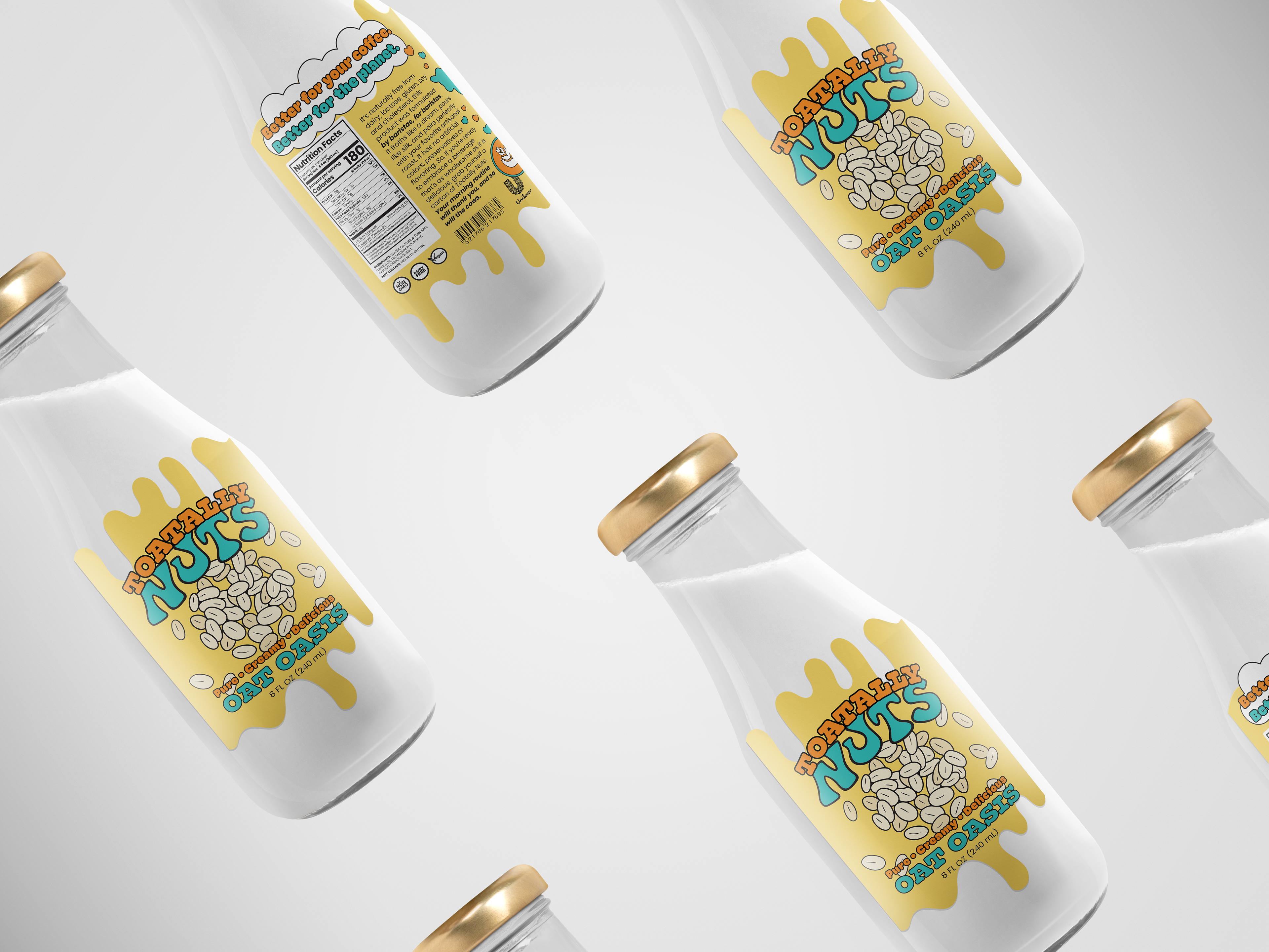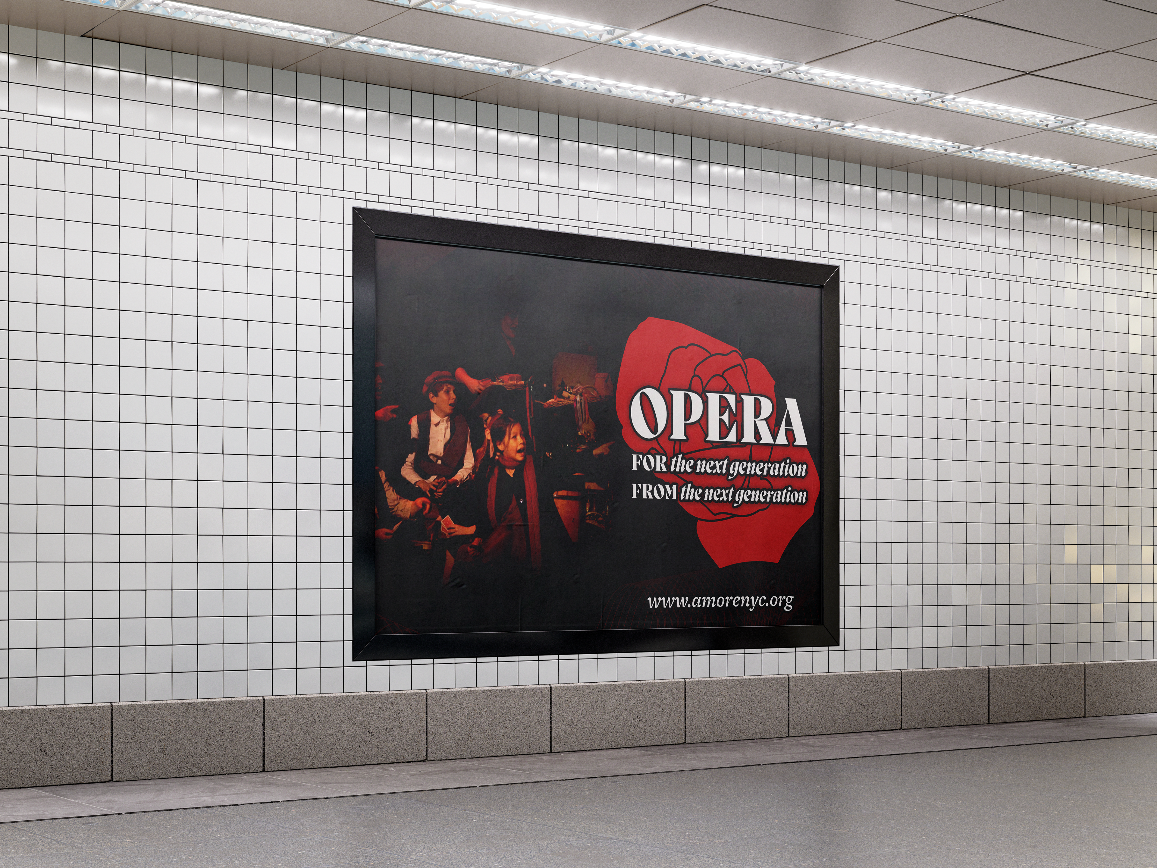
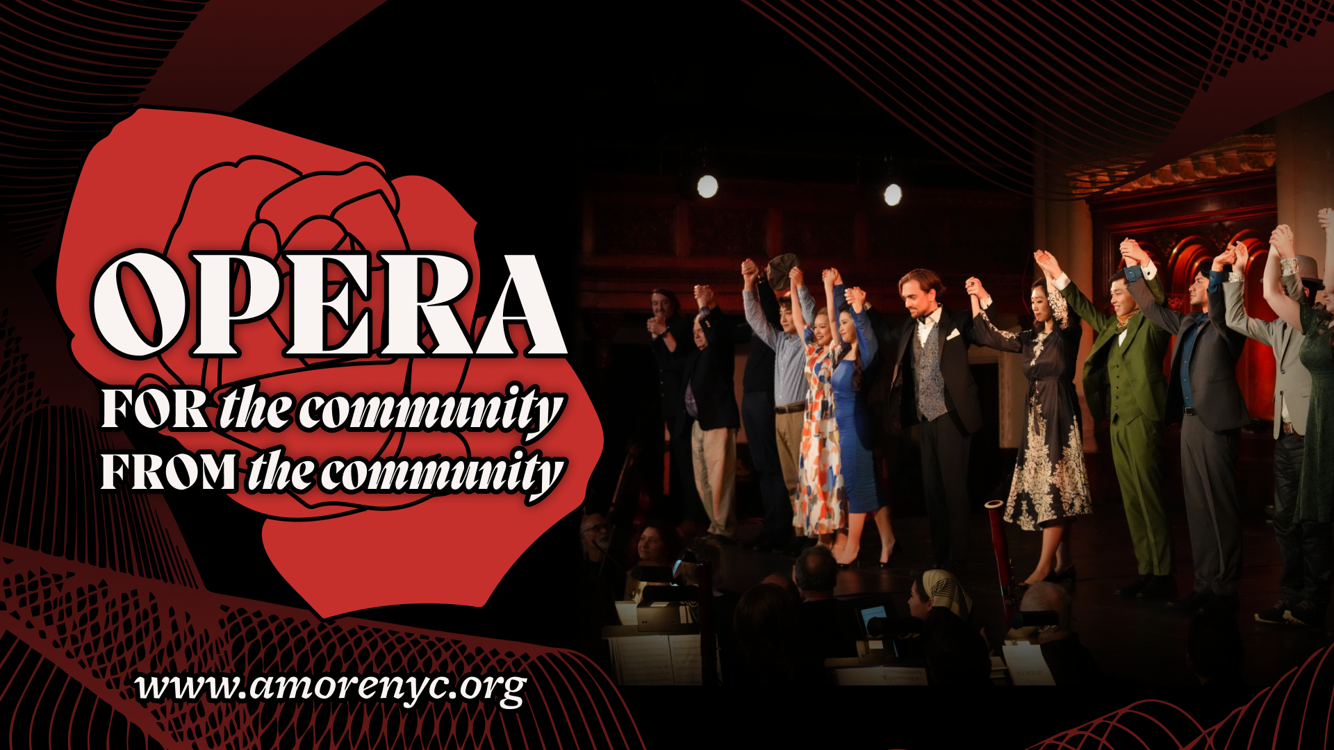
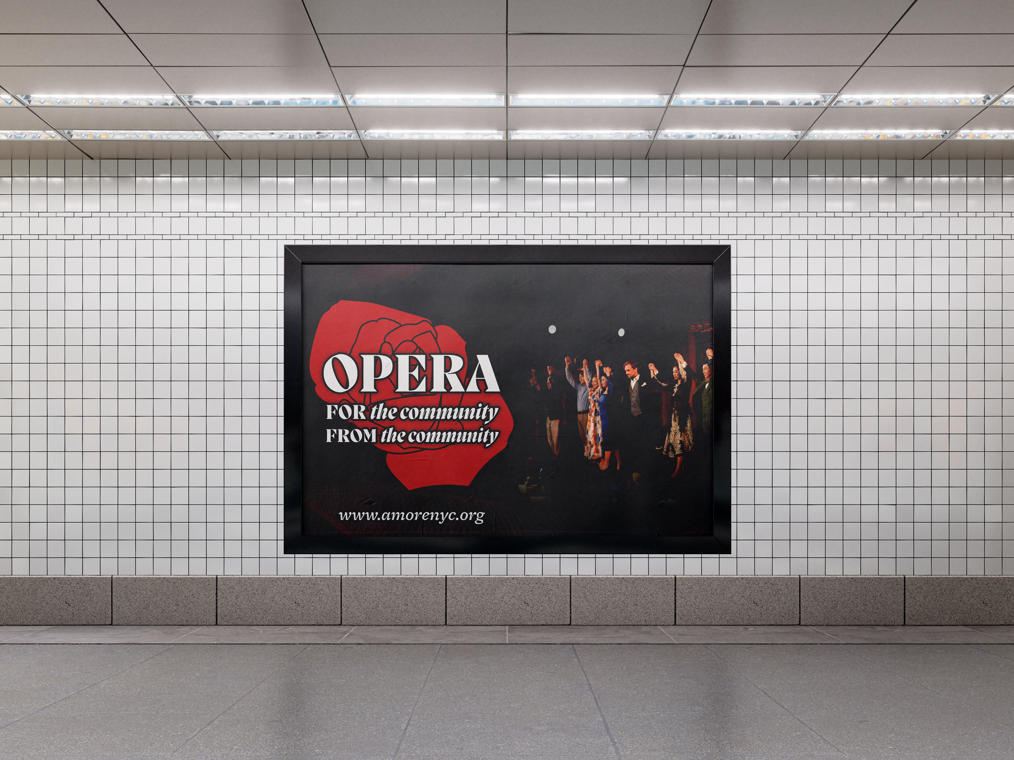


For this brand, I curated a dynamic color palette designed to evoke a range of emotions, while maintaining a whimsical essence. The chosen typefaces were carefully selected to convey sophistication and modernity. The incorporation of a rose shape within the logo not only complements the company's name but also symbolizes the romantic motifs prevalent in numerous operas. Overall, this identity was crafted to captivate young audiences who may not typically consider attending an opera performance.